TUTORIAL

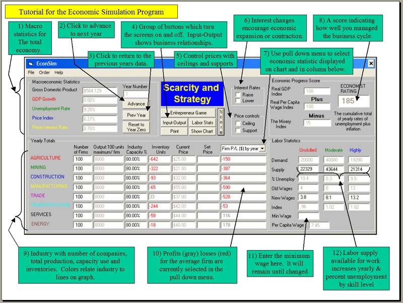
Each notation on the above main screen has a number attached to allow you to find it when it is discussed below, e.g. GDP (1), overall unemployment rate (1), pull down menu (7), minimum wage (11), highly skilled unemployment (12). The simulation initially shows the statistics for year 1, push the advance button (2) to go to year 2 and information becomes visible on the graph.
How do we get started? When the simulation is loaded into your computer, press the green ‘next year’ button at the top (#2) and advance to year two. Then push the space bar to go as far in the future as you like, up to 200 years. Let’s actually go to year 10 and stop. Every industry has worked through 10 years of changes in supply and demand to establish a product price. The business cycle for each of the color-coded industries appears on the graph. These values are programmed in the simulation and the same data will occur every time unless you change something.

